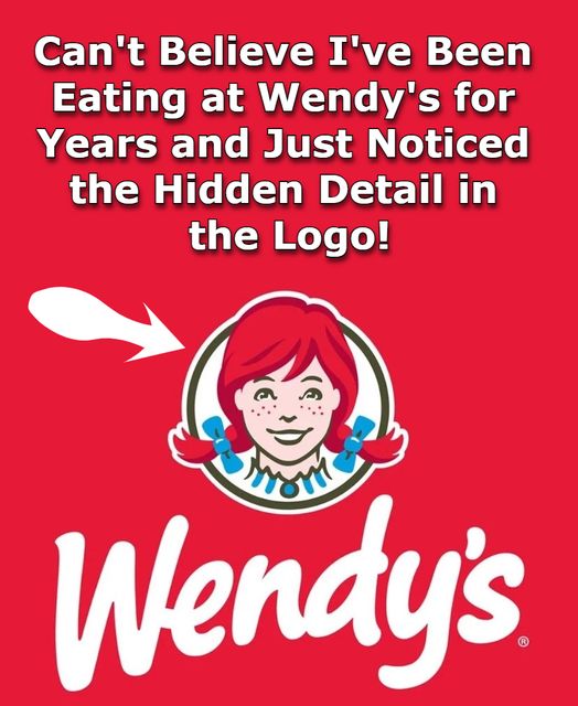
Wendy’s, the renowned fast-food chain, is instantly recognizable by its logo featuring a cheerful red-haired girl with pigtails. This image is not just a brand symbol but also a tribute to family values and home-cooked meals. A closer inspection of the logo reveals a subtle detail that many might overlook: the word “MOM” cleverly embedded within Wendy’s collar.
The ‘MOM’ in Wendy’s Collar
In the 2013 redesign of Wendy’s logo, designers introduced a subtle element into the character’s collar. The ruffles form the word “MOM,” with the letters seamlessly integrated into the design. This hidden message is most noticeable in the monochromatic red version of the logo, often seen on Wendy’s Styrofoam cups. The illusion arises from the curve of the ruffled neckline.
Symbolism and Brand Messaging
The inclusion of “MOM” in the logo aligns with Wendy’s brand identity, emphasizing homestyle cooking and familial warmth. By subtly embedding this word, Wendy’s reinforces the idea that their food offers the comfort and quality reminiscent of a mother’s cooking. This design choice enhances the emotional connection customers may feel towards the brand, associating it with the nurturing aspect of home-prepared meals.
Other Brands with Hidden Messages
Wendy’s is not alone in incorporating hidden messages within its logo. For instance, Baskin-Robbins’ logo cleverly includes the number “31” within the letters “BR,” representing their original 31 flavors. Similarly, the Tostitos logo features two individuals sharing a chip over a bowl of salsa, subtly embedded within the letters.
Conclusion
The hidden “MOM” in Wendy’s logo serves as a testament to the brand’s commitment to delivering homestyle meals and fostering a sense of familial comfort. Such thoughtful design elements not only enhance brand identity but also create deeper connections with customers, reminding them of the warmth and care associated with a mother’s cooking.


